Anniversary Logo Design - Chiefs of Ontario
This was a really meaningful and rewarding project I had the chance to work on during my internship with Design de Plume. I’m so thankful to the team for their mentorship and support throughout the process. Their guidance helped me approach the project with confidence and a strong focus on cultural respect.
The Chiefs of Ontario is a political organization that represents 133 First Nations communities across the province. They work to support and advocate for the rights, health, education, governance, and environment of First Nations people. In preparation for their upcoming 50th anniversary gala, they were looking for a special variation of their logo to mark this important milestone.
The Chiefs of Ontario is a political organization that represents 133 First Nations communities across the province. They work to support and advocate for the rights, health, education, governance, and environment of First Nations people. In preparation for their upcoming 50th anniversary gala, they were looking for a special variation of their logo to mark this important milestone.
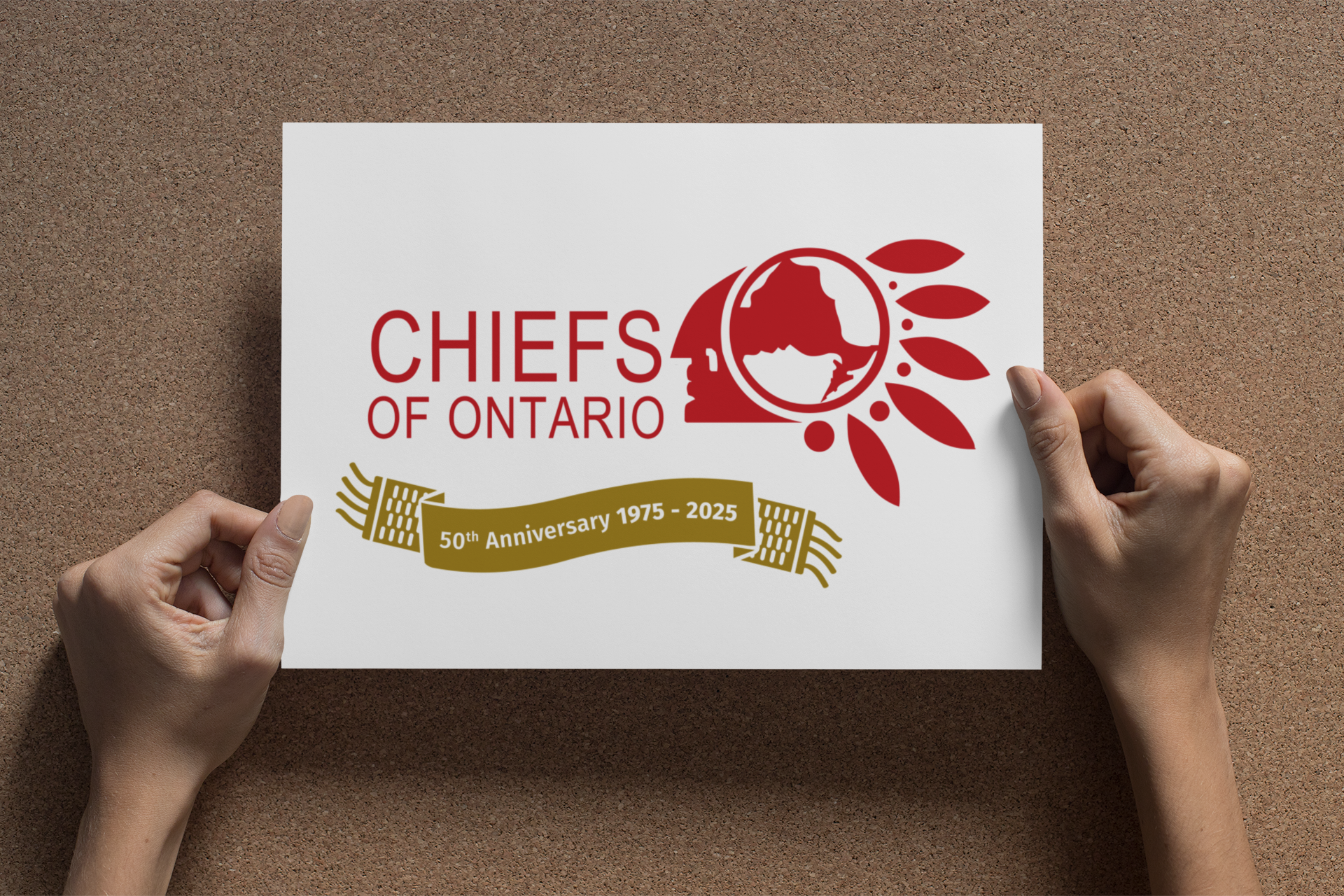
While I didn’t create their original logo, I was trusted to design a commemorative banner to pair with it. The goal was to highlight the years 1975 to 2025 in a way that felt meaningful, respectful, and visually connected to their existing brand.
Cultural authenticity was a top priority for me. Through my research, I was deeply inspired by the tradition of wampum belts, sacred, hand-beaded pieces traditionally used by the Haudenosaunee to record agreements and important historical events. These belts hold deep meaning and represent relationships, trust, and unity. That symbolism resonated with me, especially for a project honouring 50 years of advocacy and leadership.
I used this inspiration to design a banner that echoes the visual language of wampum belts while blending seamlessly with the Chiefs of Ontario’s existing logo. The final design was created for all materials for their 50th anniversary gala and other celebration events.