Logo & E-Commerce Website - Pearl's Pages
This project was all about creating an easy and enjoyable shopping experience for Pearl’s Pages. A brand designed to help students build productive and inspiring workspaces. With a focus on inclusivity, personal growth, and sustainability, the goal was to make the brand feel approachable and meaningful.
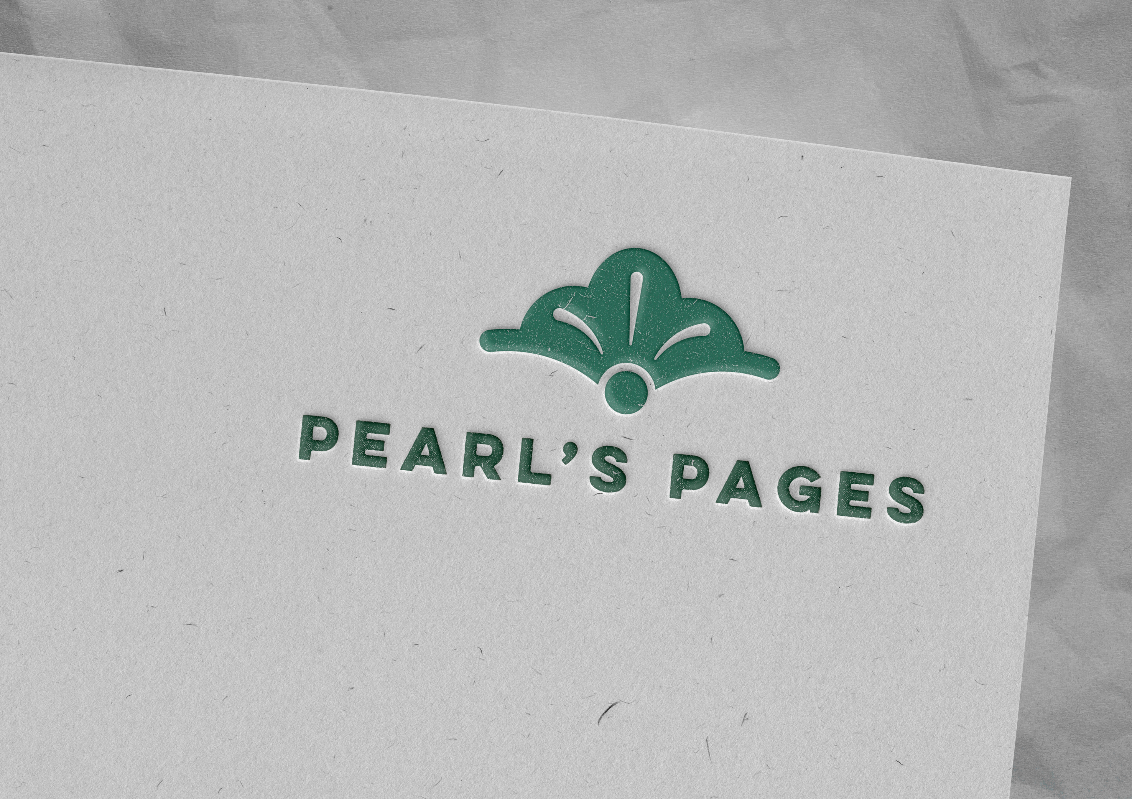
The logo, featuring a pearl in a shell, symbolizes growth and simplicity, while the subtle texture reflects the imperfections that come with learning and self-development. Soft greens and natural tones emphasize sustainability and trust, and the organic Calder font adds a friendly, down-to-earth vibe. Altogether, the design brings Pearl’s Pages to life in a way that feels relatable and inspiring for students.
The logo, featuring a pearl in a shell, symbolizes growth and simplicity, while the subtle texture reflects the imperfections that come with learning and self-development. Soft greens and natural tones emphasize sustainability and trust, and the organic Calder font adds a friendly, down-to-earth vibe. Altogether, the design brings Pearl’s Pages to life in a way that feels relatable and inspiring for students.
Branding
Logo Design

Business Card
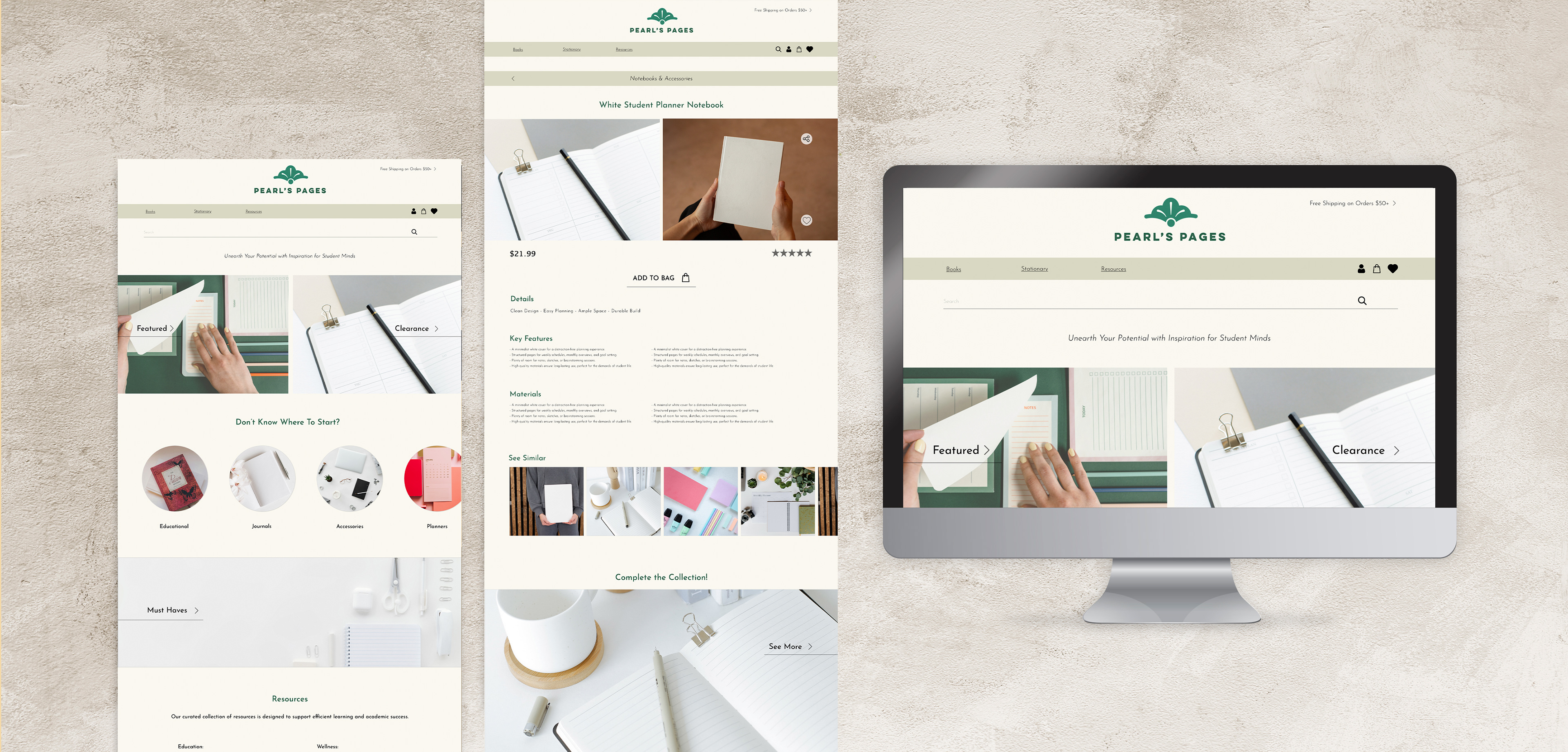
E-Commerce Website: View the project prototypes by clicking the buttons below!